Want to create a Glassmorphism Login Form that stuns the user in 2022? Here it is


Table of contents
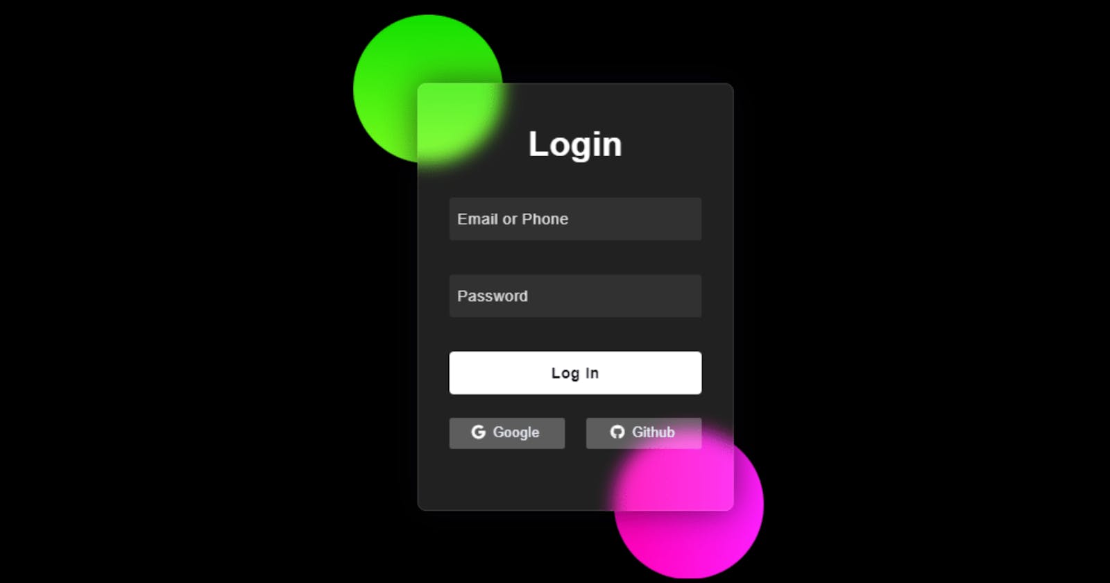
Hey Devs, Today in this post we’ll learn How to Create a Glassmorphism Login Form that will stun the user . To create it we are going to use simple CSS and HTML. Hope you enjoy this post.
Glassmorphism CSS has been gaining much popularity as a result of its stunning appearance. It is very similar to [Login Form] but differs in its transparent design. Many websites and applications like Apple and Microsoft use this type of design.
These types of classy-interface UI make User Experience better and lead to increased sales, lead generation, and customer growth.
You should also use shape psychology to represent your brand as trustworthy and build users' trust in your brand.
Demo
Click to watch demo!
##Glassmorphism Login Form CSS 2022 (Source Code) HTML Code
<!DOCTYPE html>
<html lang="en">
<head>
    <meta charset="UTF-8">
    <meta http-equiv="X-UA-Compatible" content="IE=edge">
    <meta name="viewport" content="width=device-width, initial-scale=1.0">
    <title>Design - codewithayan</title>
    <link rel="stylesheet" href="https://cdnjs.cloudflare.com/ajax/libs/font-awesome/5.15.3/css/all.min.css" integrity="sha512-iBBXm8fW90+nuLcSKlbmrPcLa0OT92xO1BIsZ+ywDWZCvqsWgccV3gFoRBv0z+8dLJgyAHIhR35VZc2oM/gI1w==" crossorigin="anonymous"/>
    <link rel="stylesheet" href="Style.css">
</head>
<body>
    <div class="container">
        <div class="circle"></div>
        <div class="circle"></div>
    </div>
<form>
        <h2 id="heading">Login</h3>

        <input type="text" placeholder="Email or Phone" id="username">
        <input type="password" placeholder="Password" id="password">

        <button id="btn">Log In</button>

        <div class="social">
            <div class="Google"><i class="fab fa-google"></i>  Google</div>
            <div class="github"><i class="fab fa-github"></i>  Github</div>
        </div>
    </form>
</body>
</html>
CSS Code
*{
    padding: 0;
    margin: 0;
    box-sizing: border-box;
}
body{
    background-color: #000000;
}
.container{
    width: 400px;
    height: 500px;
    position: absolute;
    transform: translate(-50%,-50%);
    left: 50%;
    top: 50%;
}
.circle{
    height: 174px;
    width: 175px;
    position: absolute;
    border-radius: 50%;
}
.circle:first-child{
    background: linear-gradient(
        #13e000,
        #78ff1e);
    left: -60px;
    top: -80px;
}
.circle:last-child{
    background: linear-gradient(
        to right,
        #ff00b3,
        #ff1fff);
    right: -20px;
}
form{
    height: 500px;
    width: 370px;
    background-color: rgba(255,255,255,0.13);
    position: absolute;
    transform: translate(-50%,-50%);
    top: 50%;
    left: 50%;
    border-radius: 10px;
    backdrop-filter: blur(10px);
    border: 2px solid rgba(255,255,255,0.1);
    box-shadow: 0 0 40px rgba(8,7,16,0.6);
    padding: 50px 35px;
}
form *{
    font-family: 'Poppins',sans-serif;
    color: #ffffff;
    letter-spacing: 0.5px;
    outline: none;
    border: none;
}
#heading{
    font-size: 40px;
    font-weight: 600;
    line-height: 42px;
    text-align: center;
}
input{
    display: block;
    height: 50px;
    width: 100%;
    background-color: rgba(255,255,255,0.07);
    border-radius: 3px;
    padding: 0 10px;
    font-size: 18px;
    margin-top: 40px;
    border: none;
    outline: none;
}
input::placeholder{
    color: #e5e5e5;
}
#btn{
    margin-top: 40px;
    width: 100%;
    background-color: #ffffff;
    color: #080710;
    padding: 15px 0;
    font-size: 18px;
    font-weight: 600;
    border-radius: 5px;
    cursor: pointer;
}
.social{
    margin-top: 28px;
    display: flex;
  }
social div{
    width: 150px;
    border-radius: 3px;
    padding: 7px 10px 10px 7px;
    background-color: rgba(255,255,255,0.27);
    color: #eaf0fb;
    text-align: center;
  }
  .social div:hover{
    background-color: rgba(255,255,255,0.47);
  }
.github{
    margin-left: 25px;
  }
  .social i{
    margin-right: 4px;
  }
Congratulations! You have now successfully created our Glassmorphism Login Form using HTML & CSS.
My Website: codewithayan, see this to checkout all of my amazing Tutorials.