

Hello guys, Today in this post, we’ll learn How to Create Awesome Social Media icons Hover/Effect using CSS. To create it we are going to use simple CSS & Font Awesome. Hope you enjoy our blog.
Social media icons are a very important part of our website. They allow users to quickly share our content across social media sites, expanding users in seconds with just a click.
Even if it is a small feature to be implemented; you can be creative with it and make the social icons interactive in a way that adds a unique experience for your users.
Demo
[Click] (codewithayan.com/social-media-icons-with-ho.. watch demo!
To create Social Media Icons Hover Effect we have used Font Awesome to make icons. Hence, you will need a Font Awesome link in your <head> tag. It’s very simple, all you need to do is to log into Font Awesome site and they will provide you with the Kit’s Code.
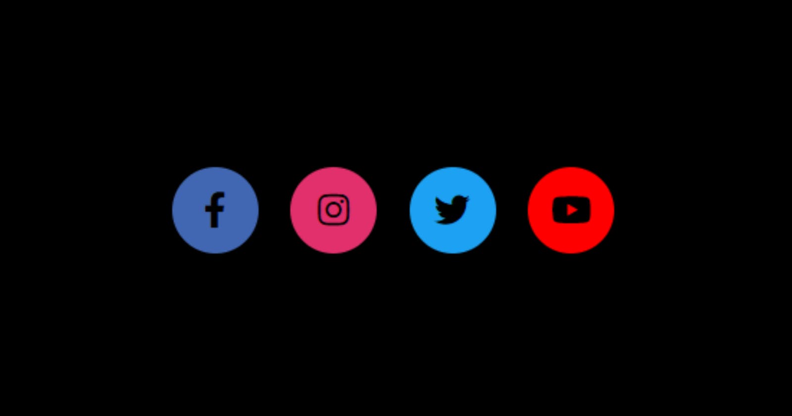
Awesome Social Media icons Hover/Effect using CSS (source code)
HTML Code
<!DOCTYPE html>
<html lang="en">
    <head>
         <title>Making Animations</title>
        <link rel="stylesheet" href="Animations.css">
        <link rel="stylesheet" href="https://cdnjs.cloudflare.com/ajax/libs/font-                     awesome/5.15.3/css/all.min.css" integrity="sha512-iBBXm8fW90+nuLcSKlbmrPcLa0OT92xO1BIsZ+ywDWZCvqsWgccV3gFoRBv0z+8dLJgyAHIhR35VZc2oM/gI1w==" crossorigin="anonymous"/>
    </head>

    <body>

        <div class="wrapper">
            <div class="button">
                <div class="icon">
                    <a class="fab fa-facebook-f"></a>
                </div>
                <span>Facebook</span>
            </div>
            <div class="button">
                <div class="icon">
                    <a class="fab fa-instagram"></a>
                </div>
                <span>Instagram</span>
            </div>

            <div class="button">
                <div class="icon">
                    <a class="fab fa-twitter"></a>
                </div>
                <span>Twitter</span>
            </div>

            <div class="button">
                <div class="icon">
                    <a class="fab fa-youtube"></a>
                </div>
                <span>Youtube</span>
            </div>
        </div>

    </body>
</html>
CSS Code
*{
    margin: 0;
    padding: 0;
    box-sizing: border-box;
    font-family: 'Poppins', sans-serif;
}
html,body{
    display: flex;
    justify-content: center;
    align-items: center;
    height: 100%;
    width: 100%;
    background: linear-gradient(315deg, #fff 0%, rgb(245, 245, 245) 74%);
}
.button{
    height: 60px;
    width: 60px;
    background-color: #fff;
    border-radius: 60px;
    cursor: pointer;
    box-shadow: 0 10px 10px rgb(94, 91, 91);
    float: left;
    overflow: hidden;
    transition: all 1s ease-in-out;
}
.button:hover{
    width: 220px;
}

.button:nth-child(1):hover .icon { background: #4267B2;}
.button:nth-child(2):hover .icon { background: #E1306C;}
.button:nth-child(3):hover .icon { background: #1DA1F2;}
.button:nth-child(4):hover .icon { background: #FF0000;}

.button:nth-child(1) span { color: #4267B2;}
.button:nth-child(2) span { color: #E1306C;}
.button:nth-child(3) span { color: #1DA1F2;}
.button:nth-child(4) span { color: #FF0000;}

.button span{
    font-size: 20px;
    font-weight: 500;
    line-height: 60px;
    margin-left: 10px;
}
.button, .icon{
    display: inline-block;
    height: 60px;
    width: 60px;
    text-align: center;
    border-radius: 50px;
}
.button, .icon a{
    font-size: 25px;
    line-height: 60px;
}
.icon{
    float: left;
}
Congratulations! We have now successfully created our Social Media icons with Hover Effect using CSS.
My Website: codewithayan, see this to check out all of my amazing Tutorials.