


Table of contents
Hey guys, Today in this post, we’ll learn How to add an Awesome animated search bar with icon using CSS and HTML. To create it we are going to use simple CSS & Font Awesome. Hope you enjoy this post.
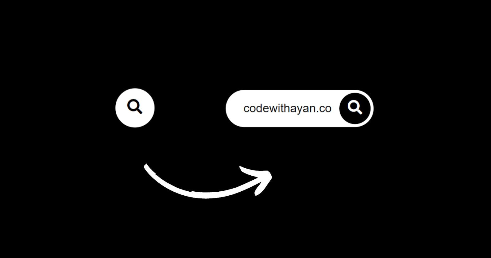
A search bar is a very important component of our website. They allow users to easily search for articles available on your blog and help them find out what they are looking for easily, which increases the friendliness of the website to users.
Extending the search box to Hover is an idea that modern websites use nowadays, with placing it in the top navbar of the website to see it easily. Even if it is a small feature to be implemented; you can be creative with it and make the Search bar interactive in a way that adds a good experience for the users.
So, let's head to create this!
Demo
Click to watch demo!
To create Animated search bar we have used Font Awesome. Hence, you will need a Font Awesome link in your tag. It’s very simple, all you need to do is to log into Font Awesome site and they will provide you with the Kit’s Code.
Animated search bar with icon HTML CSS (source code) HTML Code
<!DOCTYPE html>
<html lang="en">
    <head>
        <title>Animated Search Bar</title>
        <link rel="icon" href="animated.jpg">
        <link rel="stylesheet" href="SearchBar.css">
        <link rel="stylesheet" href="https://cdnjs.cloudflare.com/ajax/libs/font-awesome/5.15.3/css/all.min.css" integrity="sha512-iBBXm8fW90+nuLcSKlbmrPcLa0OT92xO1BIsZ+ywDWZCvqsWgccV3gFoRBv0z+8dLJgyAHIhR35VZc2oM/gI1w==" crossorigin="anonymous"/>
    </head>

    <body>
        <br>
        <form action="" id="s">
            <input type="search">
            <i class="fa fa-search"></i>
        </form>

    </body>
</html>
CSS Code
body{
    padding: 0;
    margin: 0;
    height: 100vh;
    width: 100%;
    background: #07051a;
}

form{
    position: relative;
    top: 50%;
    left: 50%;
    transform: translate(-50%,-50%);
    transition: all 1s;a
    width: 50px;
    height: 50px;
    background: white;
    box-sizing: border-box;
    border-radius: 25px;
    border: 4px solid white;
    padding: 5px;
}
input{
    position: absolute;
    width: 100%;
    height: 42.5px;
    line-height: 30px;
    display: none;
    font-size: 1em;
    border-radius: 20px;
    padding: 0 20px;
    top: 0;
    left: 0;
    outline: 0;
    border: 0;
}
.fa{
    box-sizing: border-box;
    padding: 10px;
    width: 42.5px;
    height: 42.5px;
    position: absolute;
    border-radius: 50%;
    color: #07051a;
    text-align: center;
    font-size: 1.2em;
    transition: all 1s;
    top: 0;
    right: 0;
}
form:hover {
    width: 200px;
    cursor: pointer;
}
form:hover input {
    display: block;
}

form:hover .fa {
    background: #07051a;
    color: white;
}
Congratulations! We have now successfully created our Awesome Animated search bar with icon and Hover Effect.
My Website: codewithayan, see this to checkout all of my amazing Tutorials.